
970x125
From legendary bands to the 250th anniversary of the United States, all 30 MLS teams are leaning into all sorts of inspiration for their new kits.
With the 2026 FIFA World Cup coming to North America this summer, there’s plenty of attention on MLS as its season gets underway on Feb. 21. And that includes some new sharp designs to lean into each team’s local identity and culture.
Some teams, including defending MLS Cup champions Inter Miami, will release their kits on Wednesday. Let’s dive in.
Jump to: Atlanta United | Austin FC | Charlotte FC | Chicago Fire | FC Cincinnati | Colorado Rapids | Columbus Crew | D.C. United | FC Dallas | Houston Dynamo | Sporting KC | LA Galaxy | LAFC | Inter Miami | Minnesota United | CF Montréal | Nashville SC | New England Revolution | Red Bull New York | NYCFC | Orlando City | Philadelphia Union | Portland Timbers | Real Salt Lake | San Diego FC | San Jose Earthquakes | St. Louis City SC | Toronto FC | Vancouver Whitecaps
Austin FC

Austin FC’s jersey incorporates vertical stripes by blending new shades of the team’s signature verde with aquatic green, inspired by the landscape and clear waters of Austin local landmarks such as Barton Springs, Zilker Park, and the Hill Country.
CF Montréal

The Canadian club’s jersey is inspired by its 2015 kit and reimagined with bold, organic stripes. The look is also meant to raise awareness about prostate cancer and to support those who have been affected by the disease.
Charlotte FC

Charlotte FC, now five years in existence, returns to a core visual that defined their team’s initial days but also reinforces its vision to be progressive, collective, and ambitious.
Chicago Fire

A modern update and an evolution of the team’s popular Return to Red jersey, it refines the club’s iconic identity with classic red, a crisp collar, and sleeve details in the city’s colors.
LA Galaxy

The LA Galaxy’s trademark blue sash adorned with golden trim remains front and center of this look, but with a bolder look. The return of vibrant blue is meant to signal three attributes of the road ahead: bright, confident, and in constant movement.
LAFC

LAFC’s black-and-gold kit is inspired by the Grand Lobby of home stadium BMO Stadium, which in itself pays homage to Los Angeles’ rich art deco heritage. As the team puts it, the pattern captures the glamour, optimism, and modernity that define L.A.
Minnesota United

The Loons have now celebrated a full decade in MLS, and this look revisits the club’s inaugural design with a modern edge. A bold black base includes the original blue sash, symbolizing the Mississippi River that flows through both the crest and the state.
Nashville SC

This is known as the Reverb Kit, and rightly so for the team that hails from Music City. This look aims to capture “the electric roar of our supporters, the passion of our players, the remarkable music made in our city and shared with the world.”
New England Revolution

An apt jersey to celebrate America 250. Inspired by patriotic bunting and July 4 fireworks that light the skies each summer, the Revs’ jersey includes the Heritage Tree and “Est. 1776” sign-offs. The jersey honors the region’s role in America’s founding and celebrates a milestone year.
NYCFC

The 2026 All-Nations Kit celebrates New York City as the world’s capital, a place where cultures, languages, and traditions converge. Inspired by the city’s flag, the kit reflects unity in diversity while metallic details evoke the Unisphere located in Queens – and close by NYCFC’s future stadium.
Orlando City

Did Orlando strike gold here? The Sunken Treasure kit dives into Florida’s storied coastline and the legend of the 1715 Treasure Fleet. Inspired by shipwrecks and sea exploration, this is the Lions’ first-ever predominantly gold jersey – although the look includes trademark deep purple accents.
Philadephia Union
The 1776 Kit honors Philadelphia’s role in the United States founding and its enduring spirit of rebellion and unity. Inspired by the city’s architecture, documents, and icons that shaped the USA, the design features “1776” jock tag and the club’s signature “Join or Die” emblem.
Portland Timbers

The kit celebrates the 100th anniversary of Providence Park, home of the Timbers. Drawing from the stadium’s arches and 1920s architecture, the design weaves intricate patterns and alludes to the ivy that climbs the stadium walls in the heart of Soccer City USA.
San Diego FC
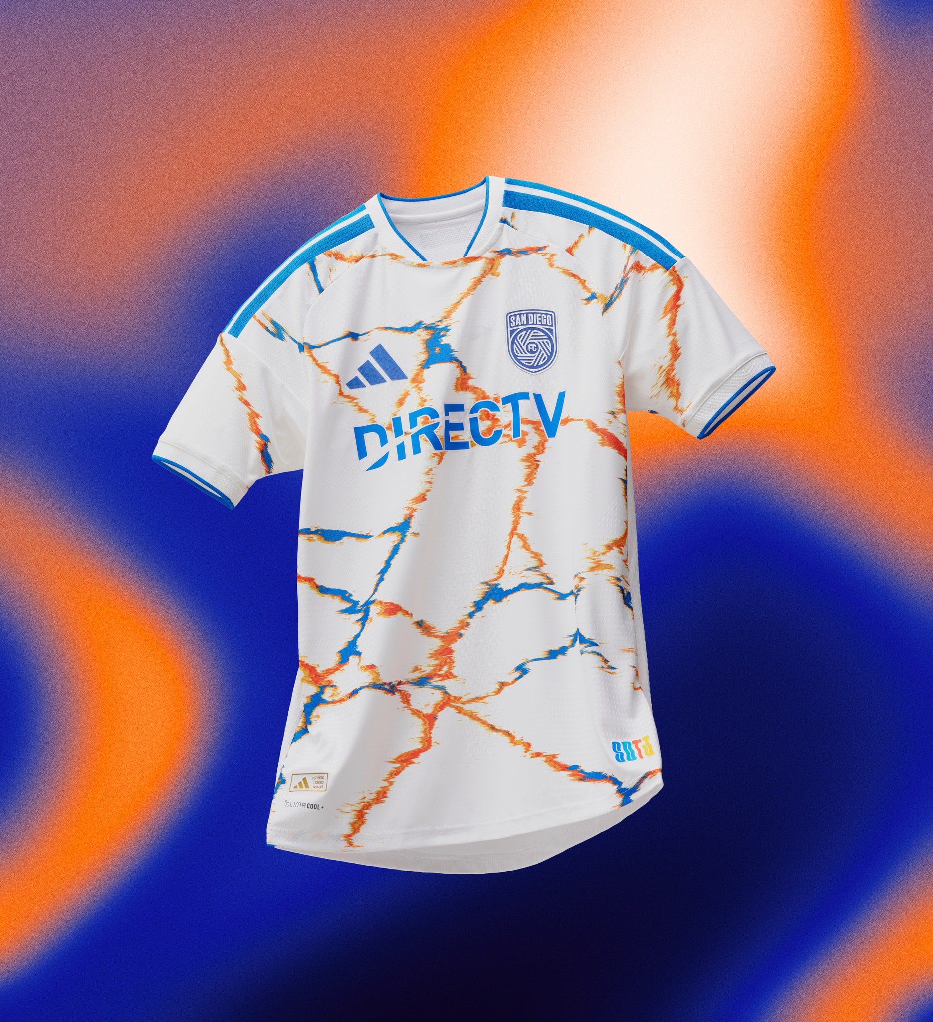
The team will enter its second season in existence with a kit that is inspired by the shared culture of San Diego and Tijuana. The SDTJ jock tag, crafted by local artist Pigmento, symbolizes the daily exchange between both cities, further highlighted by the “Sin Fronteras” emblem.
San Jose Earthquakes

Featuring the Grateful Dead’s most recognizable marks, this kit honors the legendary group’s first 1965 show in San Jose. The kit is inspired by the band’s psychedelic roots with a tie-dye design bursting with bright pastel color.