970x125
This content contains affiliate links. When you buy through these links, we may earn an affiliate commission.
It’s been a stellar year in book cover design, and the third quarter of 2025 continues to prove this. Designers have upped their game, creating compelling images intended to force readers to judge a book by their covers–and frankly, why shouldn’t you? So many of the covers here were ones I would likely have missed if I hadn’t been taken in by their looks.
Book cover design is interesting because it’s got to play to some trends, got to play to some conventions of genre and age category, and because it’s got to play to consumer tastes. We need book covers to sell a book—it’s the number one marketing opportunity for any title. But we need those covers to also give insight into the story and to be nice to look at and to be easy to render on mobile.
Important to all of this is the team behind the cover’s creation. For too long—and still to this day—cover designers and artists are rarely credited for their work. The time it takes to find this information is embarrassing in 2025, and still, many of the covers you’ll see below don’t have this information available. Publishers still don’t put it on the landing pages for these books, so it takes good Googling and a lot of luck to dig up names to credit. Unfortunately, this also makes it easier for AI-generated art to get through to book covers (which we started to see last year). This quarter may be one of the better ones in a long time for finding this information.
One of the other fun things to notice throughout the year are the trends we see in cover design. Something other book outlets have pointed out in cover design is the trend to use works of art as the background for cover design. This won’t be slowing down into the rest of the year or into 2026, either.
Find below a number of the most interesting, visually surprising, and best book covers of 2025 from the third quarter of this year. These covers are for adult fiction only, as there are entire posts’ worth of covers for nonfiction, YA, middle grade, and children’s books. Because my earlier roundup of the best book covers for 2025’s new and forthcoming short story collections didn’t capture some of the books that hit shelves in the second half of the year, you’ll see short story collections here, too.
All of the covers featured here are for books published between July 1 and September 30, 2025. I’ve done my best to track down credit. You can and should check out the best book covers from the first quarter of this year and the second quarter of this year, too.

Beyond All Reasonable Doubt, Jesus Is Alive by Melissa Lozada-Oliva, Cover design by Luísa Dias
There are many things going on with this cover and every single one of them is good. Titles that are full sentences are a favorite of mine, but more than that, it’s one that’s hard to forget. The cover gives desolation vibes on the top photo, but the toy (?) hand and coy cat stand in contrast to those vibes, begging the viewer to wonder what is actually going on. Let’s not overlook the clever blood splatter, either, nor the way the yellow contrasts so perfectly with the red shades elsewhere. That some of the image is off the page gives more visual interest, too.
All Access Members, check out your exclusive content–including 19 more rad covers–below.
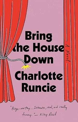
Bring the House Down by Charlotte Runcie, Cover design by Oliver Munday
Pinks and reds are among the prominent colors in standout covers this year, and this very basic–yet very visually arresting–take on stage curtains utilizes both. The title and author font are pretty basic as well, though the change of font for the blurb on the cover doesn’t distract from the main feature at all.
On a less design-angled note, this cover makes me think of this particular Simpsons scene.

Chilco by Daniela Catrileo, translated by Jacob Edelstein, Cover design by Charlotte Grimm
Vintage-inspired covers are not new and sometimes, even the best designed ones can blend into one another. This one stands out, though, for its visual contrasts between the bold magenta flower, the vibrant green background, and the gray-white and black colors for the title and author. That flower’s shape brings movement to the image, especially in light of the severe-looking font choice. The little pretend fold lines at the top left of the cover and on the bottom right are nice details, too.
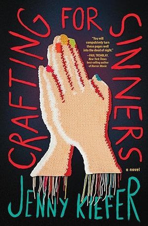
Crafting for Sinners by Jenny Kiefer, Cover Crochet by Nicole Nikolich, cover Design by Andie Reid
The publisher hired a person to crochet this cover, and frankly, that’s enough to warrant placement on a list of great covers. But the colors all work here, too, as does the font for the title and author. My favorite elements outside of the obvious are the multi-colored nails and the unfinished edges at the wrists. Though the cover is not textured, it certainly looks that way.
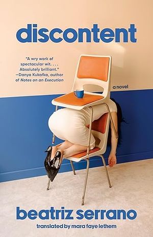
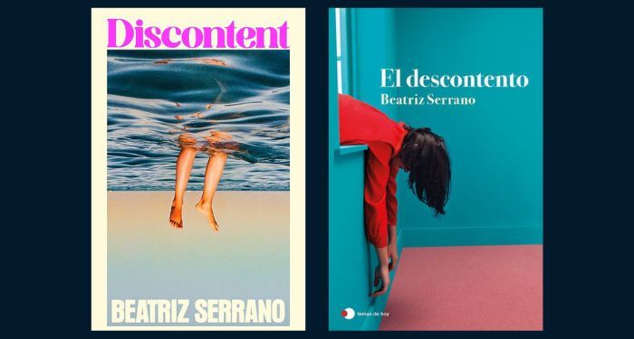
Discontent by Beatriz Serrano, translated by Mara Faye Lethem
It’s the person between two vintage chairs that stands out, of course, but that’s not solely what makes this cover so good. It’s that that image is paired with an all lower case title and authorship done in a blue that perfectly matches the paint on the lower half of the wall. The blue and lower case letters manage to simultaneously draw attention to the strange image and also downplay it a lot. Black heels on the model’s feet don’t hurt, either.
“Photos of people in bizarre shapes” among the best covers of 2025’s third quarter is not going to be limited to this one. This isn’t the only version of discontent utilizing the jarring image of half a body to sell the book, either. Check out the UK and Spanish versions below. Both are also good, but the US edition slightly edges both out (it’s the color palette).
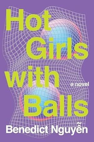
Hot Girls with Balls by Benedict Nguyen, Cover design by Sarah Brody
Brody’s cover for Nguyen’s book is straight out of a 1980s video game, and that’s a high compliment. Nothing here should work and yet it does. Though there is an image here this book cover is entirely font driven with its contrasting neon green on purple background. The word play here is clever enough on its own, but the actual image itself enhances it because it forces you to figure out what the balls are (volley) and what makes the girls hot (…the heat).
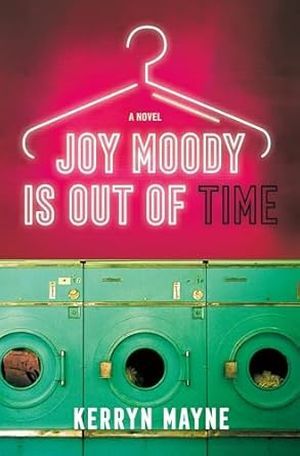
Joy Moody Is Out of Time by Kerryn Mayne
This cover has been sitting in my “can’t wait to write about it” pile since I first saw it, and now that I get to write about it, I find there’s not a whole lot that needs to be said about why it is so good. It’s the contrasting colors and shapes. It’s the neon sign serving as the book’s title. It’s the sign missing some of its lights on the perfect word. Is “Joy Moody” as a name a little on the nose? Sure, but it doesn’t matter because the cover is so good.
Contrast this US cover with the original published in Australia. The difference in what the book conveys in terms of tone, mood, and genre are quite different.
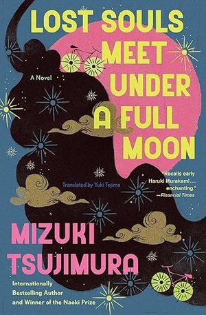
Lost Souls Meet Under a Full Moon by Mizuki Tsujimura, translated Yuki Tejima, Cover design and illustration by Farjana Yasmin
Movement. That is the key element of this cover. Despite having a lot of things going on, they’re all in harmony. From the range of colors to the clouds, stars, and sun, from the big bold fonts to the small stars grounding the moving black element (is it smoke? Is it dark water? Is it the joining of two bodies or souls?), this cover just sings.
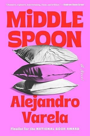
Middle Spoon by Alejandro Varela, Cover design by Colin Webber
One of the best details in this cover is right in the word “Middle.” The “i” is lower case, whereas all of the other letters are not. Had there been more lower case letters sprinkled throughout, it would have felt more hokey or even a little Brady Bunch and therefore discordant with the title and the image of three pillows. But instead, that little detail gives the perfect impression of a middle spoon between a big M and a big D.
The hyper-color pillows have great texture here, too. The white for the blurb, for the words “a novel,” and for the honors Varela has racked up is maybe a little distracting from the cover, but their placement does help ground the image nicely.
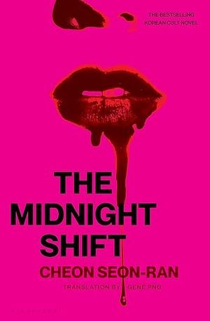
The Midnight Shift by Seon-Ran Cheon, translated by Gene Png
Pink, red, and bloody: that’s what makes this cover work. Usually those “up the nose” covers are more gross than gratifying, but the way the face is trimmed for this cover allows those nostrils to not stand out in an uncomfortable way. It’s the bloody lips that do instead.
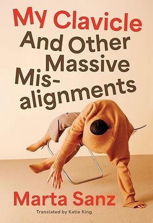
My Clavicle and Other Massive Misalignments by Marta Sanz, translated by Katie King, Cover design by Jaya Nicely
The second entry into the category of “photos of people in bizarre shapes” among great covers this quarter is this one. Not only do we have another great title, but we’ve got a lot of jarring angles between human limbs and chair limbs, as well as the title alignment. That ecru coloring is once again creating some calm in what’s an otherwise chaotic image. Even the red for part of the title and the author’s name isn’t creating discordance here but bringing some stability instead.
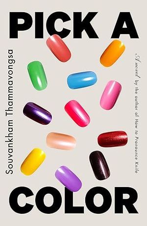
Pick a Color by Souvankham Thammavongsa
We’ve got shape with the rectangle composed of the book title, book author, and author accolades. Then we’ve got shape with color in the colorful nails. It’s really a simple cover but it captures exactly what the book is about in an effective and eye-catching way.

The Satisfaction Cafe by Kathy Wang, Cover art by Kosta Morr, Cover design by Jaya Miceli
The deeply saturated colors give the image here a surreal look, despite being a pretty everyday image of a cafe. It’s a pleasing variety of colors, too, with a nice balance of light and shadow. The title and author color and font blend in nicely while not getting lost. Despite the cafe being empty, there is a lot of energy in the image. I found myself spending a lot of time on Morr’s Instagram feed after discovering he was the artist.
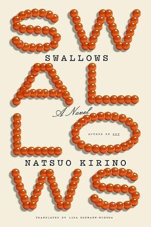
Swallows by Natsuo Kirino, translated by Lisa Hofmann-Kuroda
Sometimes, there is no need for any image on a cover for that cover to be good. Sure, we’ve seen many a trend with font-focused design on covers and while many were fine, few really stood out as unique or different. This cover certainly stands out for how it creates its title letters out of what appear to be beads. The orange hue against the cream background adds dimension. My only slight issue with the cover is that I wish they didn’t add the title again beneath the S and W–I get why that decision was made, as the word Swallows could be tough to read the way it’s laid out, but anyone who slows down would get it without the repetition.
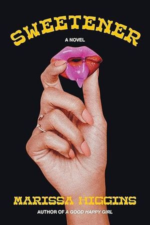
Sweetener by Marissa Higgins, Cover design by Sarah Brody
It’s a bit of a circus-y font for the title and byline on this cover, which juxtaposes nicely with the sugary lips being held by a hand with some sharp-looking nails. The cover design and art are simple. What makes this one sing are those little unexpected elements, including the variety of colors and the restraint in not making those nails stand out with too bold a hue.
Though it gives the vibes of a vampire novel–blame seeing too many lips like this on YA covers that were vampire stories–that this is the cover for a screwball comedy also makes perfect sense.

Trigger Warning by Jacinda Townsend, Cover design by Kimberly Glyder
Less is more for this cover. Sure, we’ve got a banged up car on top of the author’s last name which draws the eye toward it. But it’s the bright green background and peach font choices that create a clash and tension only further set off by the dangling “G” in the title. Nothing about any of these elements are what we might associate with what trigger warning means, engaging reader curiosity as to what that title and image might be referring to in the book.

Underspin by E.Y. Zhao, cover design by Rodrigo Corral
There’s a little bit of a balls theme this quarter in coverland, but why wouldn’t there be? We’ve already seen volleyballs that were a little hard to decipher without knowing what the book was about. Now, ping pong balls spelling out the title of Zhao’s novel which would be difficult to decipher without the image of a pair of pingpong players in the image (these could easily be Bingo balls). I don’t especially love the ping pong players image, as I think the cover would be stronger without it, but I get the reason it’s there and still think this is a fun, fresh way to create a font-driven design.

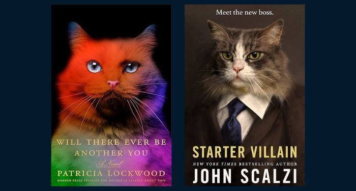
Will There Ever Be Another You by Patricia Lockwood
No one needs a lengthy paragraph on why a technicolor cat deserves your attention. But this technicolor cat deserves your attention, and its piercing blue eyes are a big part of it. The cat softens the title color and font in a satisfying way.
This isn’t the first cat cover model/mug shot for a novel in recent memory, either. Will There Ever Be Another You immediately calls to mind this fantastic cover from last year.

The Woman Dies by Aoko Matsuda, translated by Polly Barton
Generally, these best book covers roundups are for US-based designs. But in the case of this tremendous cover from the UK’s Europa Editions, there’s an exception to be made.
How can a girl simply be blowing bubbles with her gum when she’s not only clearly being swallowed by a shark but her fate is the name of the title? It doesn’t natter because it creates visual interest immediately. So, too, do the colors and illustrative nature of the design. One teeny element with an especially big impact are the black waves on top of the pink background. There’s so much energy here, and it’s not coming from the shark.
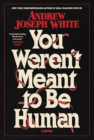
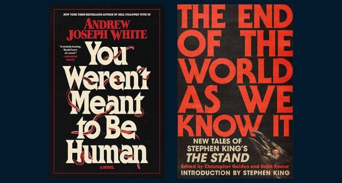
You Weren’t Meant to Be Human by Andrew Joseph White, Cover design by Drusilla Adeline
Look. When you know the elements that make for a good horror novel, you also have an idea of what makes for a good, trope-y, allusion-y cover to draw readers in. The design of White’s debut adult novel knows what it’s doing here. There’s classic horror coloring with the red, black, and cream palate. There’s the classic horror font for the title and byline. Then, there’s the creepy element of worms slinking their way through the title of the book. It’s simple and not simple all at once. The UK cover for this one takes the vintage paperback horror look up another level, too.
If you’re looking at this one and thinking it not only looks familiar to works of classic and pulpy horror, you’re not wrong. There’s another book that published this year that honors one of those classics with a very similar cover, too. Check out the side by side of You Weren’t Meant to Be Human and The End of the World As We Know It: New Tales of Stephen King’s The Stand.